Samantha Chetboul

Mireille

Role: Brand Designer (Self-initiated concept)

Brand identity and visual system designed for Mireille, a small-batch Parisian pâtisserie concept rooted in family heritage, market culture, and modern restraint.

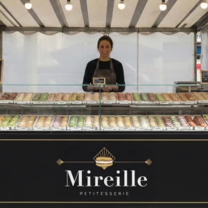
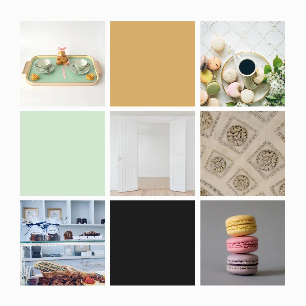
Lucie Dupont is a Paris-based pâtissière who learned the art of macaron-making from her grandmother, Mireille, using a family recipe passed down through generations. During childhood summers, Lucie often visited Claude Monet’s gardens in Giverny with her family, where color, balance, and natural rhythm quietly shaped her visual sensibility.

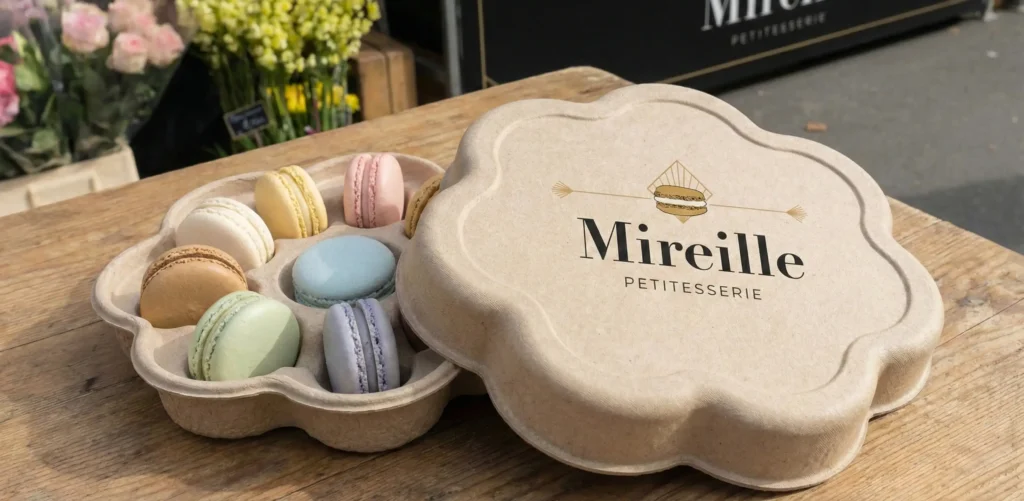
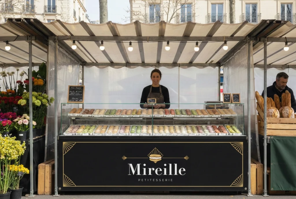
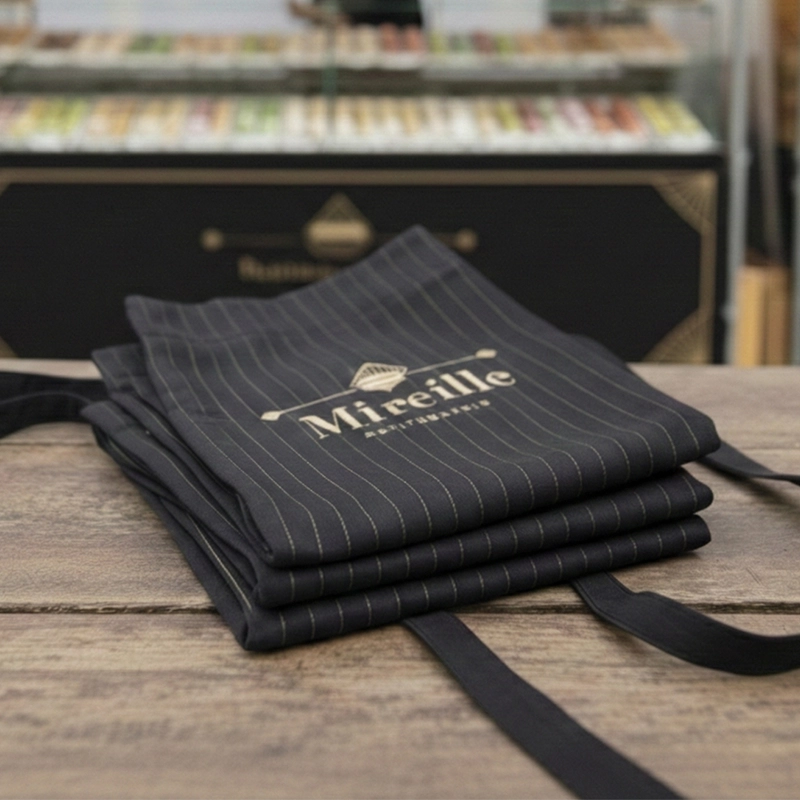
Mireille reflects this lineage. A brand rooted in care, memory, and craft, designed to feel familiar and personal within a local market setting.

Brand Positioning Snapshot

Category

Small-batch market pâtissière


Audience

Local market shoppers who value small businesses and handmade goods

Personality

Warm, composed, quietly confident

Tone

Refined, human, and understated

Visual Foundations

Moodboard & Direction

The visual direction balances softness and structure. The brand needed to feel warm and human without leaning decorative or nostalgic. Early exploration focused on proportion, negative space, and restraint, ensuring the system felt considered rather than ornamental.

Logo & Wordmark

The Mireille wordmark balances classic French typography with a contemporary structure. High-contrast letterforms reference traditional pâtisserie signage, while simplified proportions keep the logo approachable and adaptable across physical and digital applications.

The supporting descriptor was intentionally reduced to place emphasis on the name itself, reinforcing clarity and confidence. Petitesserie, a portmanteau of petite and pâtisserie, references the brand’s small-batch production and intimate scale.

Color Palette

The color palette draws inspiration from the floral tones of Monet’s gardens in Giverny. Soft, layered hues work together like a bouquet, creating warmth and variety while remaining cohesive.

The palette supports a welcoming, everyday elegance rather than a precious or ornamental feel.

Colors are used sparingly and intentionally, allowing variation while maintaining cohesion across packaging and environmental applications.

Typography

Didot anchors the brand with heritage and refinement, while Gilroy provides clarity and warmth across supporting materials. The pairing allows the identity to feel both traditional and practical, well suited for signage, packaging, and printed touchpoints.

Patterns

Custom patterns were developed using simplified geometric and floral motifs drawn from the brand’s visual language. Used sparingly, they add texture and familiarity without overpowering the core identity, reinforcing the sense of thoughtful, handmade care.

BRAND IN CONTEXT
& PACKAGING

The brand was designed to live naturally within a Parisian street market environment, alongside other small vendors and neighborhood staples. Applications prioritize realism and restraint, ensuring the identity feels integrated and approachable.

Packaging favors lightweight, eco-conscious materials over rigid luxury boxes. The flower-inspired structure references the brand’s visual language while reinforcing the idea of small batches, care, and intention.

Packaging Concept

Mireille’s packaging reflects its small-batch, market-based ethos. Lightweight, eco-conscious materials replace traditional rigid boxes, reinforcing accessibility while preserving elegance.

The flower-shaped macaron box references the brand’s floral palette and Giverny inspiration through geometry and symmetry rather than decoration. The structure balances protection, presentation, and material honesty.

Market Booth

The booth was designed to feel welcoming and understated, creating a calm presence within the market environment. Its simplicity ensures the focus stays on the macarons and the experience of buying them.

Point of Sale Extras

Business Cards – Printed business cards offer a simple, personal introduction to the brand. Minimal typography and careful spacing keep the focus on clarity and approachability rather than promotion.

Branded Apron – The Mireille apron was designed as a working uniform, extending the brand into everyday market interactions. Black fabric grounds the design, while restrained gold detailing references Art Deco influences in a subtle, wearable way.


From Concept to Execution

This project demonstrates a brand system designed with warmth, restraint, and real-world context in mind. Every element supports credibility, approachability, and longevity, allowing Mireille to feel like a natural part of the local market rather than a constructed concept.